


For the last few years the rise of data journalism has generated some hope that newsrooms could make use of new technologies for better reporting. But what about enabling newsrooms to create new servi...
Events - data journalism

A brief introduction to train all journalists on effective use of line charts, bar charts, pies and combinations. The main goal is to teach what makes a correct, basic chart and why. Level: beginner...

Examples of ways to interpret your geodata. Visualizing geodata - pretty maps. Descriptions and short examples of significant tools to manipulate and visualize geodata, on desktop and online. Lev...

From The Migrants Files and Generation E experiences, data journalism has become a distributed and multi-linguistic phenomenon able to shed light on strictly European phenomena and create an unpre...
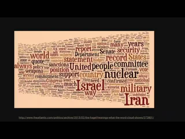
On wordclouds and 3D charts -- and why sometimes it's ok to break rules in data visualization. There are lots of lists of do's and don'ts in news graphics, but while being helpful in theory, many o...
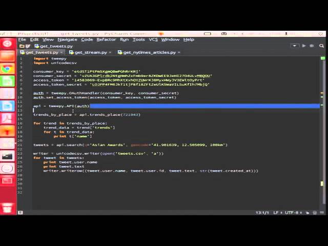
Learn how to use social media to break stories by harnessing the power of twitter data. This workshop will give you an overview of what APIs are and when are they useful, as well as a hands on w...

Introduction to the essentials of how websites are built, followed by a hands-on training on scraping them with simple tools like import.io. Level: beginner/intermediate. Organised in association w...
While we would all like for our journalistic evidence to be delivered to our doorsteps in nicely-formatted spreadsheets, more often than not that is not the case. Instead, information often comes as...

Learn how to make simple, interactive projects using Arduino hardware. We'll walk through a couple of easy projects to give you a feel for what's possible and show a few examples of what other news ...

Floods in Pakistan? Let’s find out how much donor aid Pakistan receives for infrastructure each year. Corruption in the Palestinian Authority? We can calculate which ministry spends the most on wa...